Product Design

A route to someone real.

We reimagined Contact Us as a clearer path to the right inbox, useful destination, or real person.
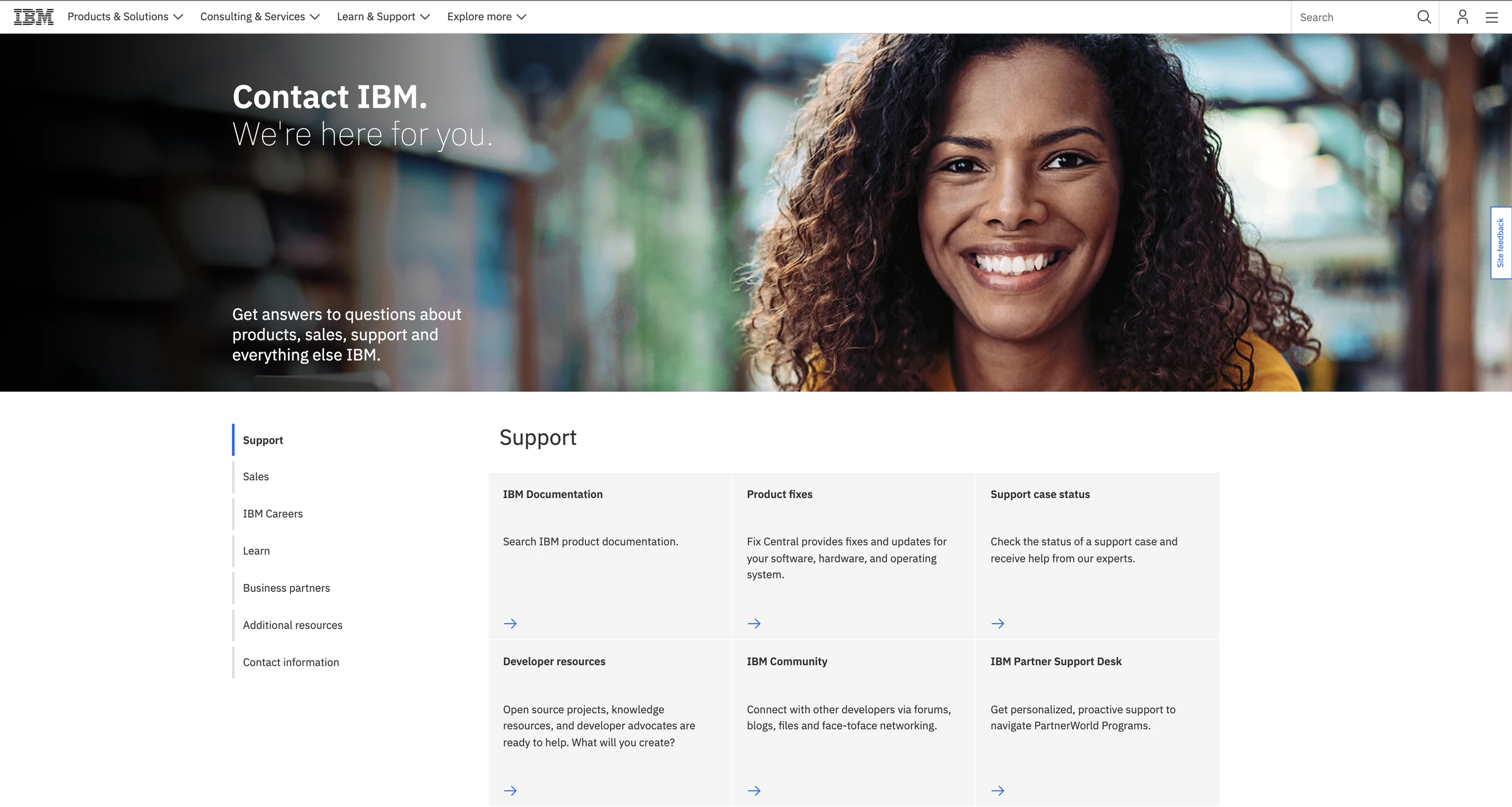
2021 IBM Contact Us future-state opening with a warm welcome and support routes
Historical deliverable | 2021 conceptPresentation motion highlights the preserved future-state composition.

Chapter 01 | An incubator brief

Six weeks to imagine a better front door.

I chose the IBM.com Contact Us experience from the incubator assignments and joined four other designers to propose what its future state could be.

My official role was Visual Designer, but the work crossed disciplines. I conducted several early sponsor-user interviews, helped guide team decisions, and took a larger hand in the mid- and high-fidelity UX as the concept became tangible.

Five-person team · 2021 · six-week concept. This was collaborative work. I helped connect research, interaction decisions, visual direction, prototype, and final story. The future-state concept did not become the production page.

Chapter 02 | The dead end

Useful if you already knew IBM.

The old experience did not accomplish much for someone who was new, smaller, or simply unsure where a question belonged.

If you were a primary customer with a representative, you had a shortcut. For the “lil ole user,” the page could become a dead end. The team also saw the receiving-side burden: many categories, poorly differentiated support destinations, and requests that still needed to be sorted by people.

We combined sponsor-user interviews with competitor analysis and Google 360 and IBM internal-search data. The historical playback distilled that work into two practical tensions.

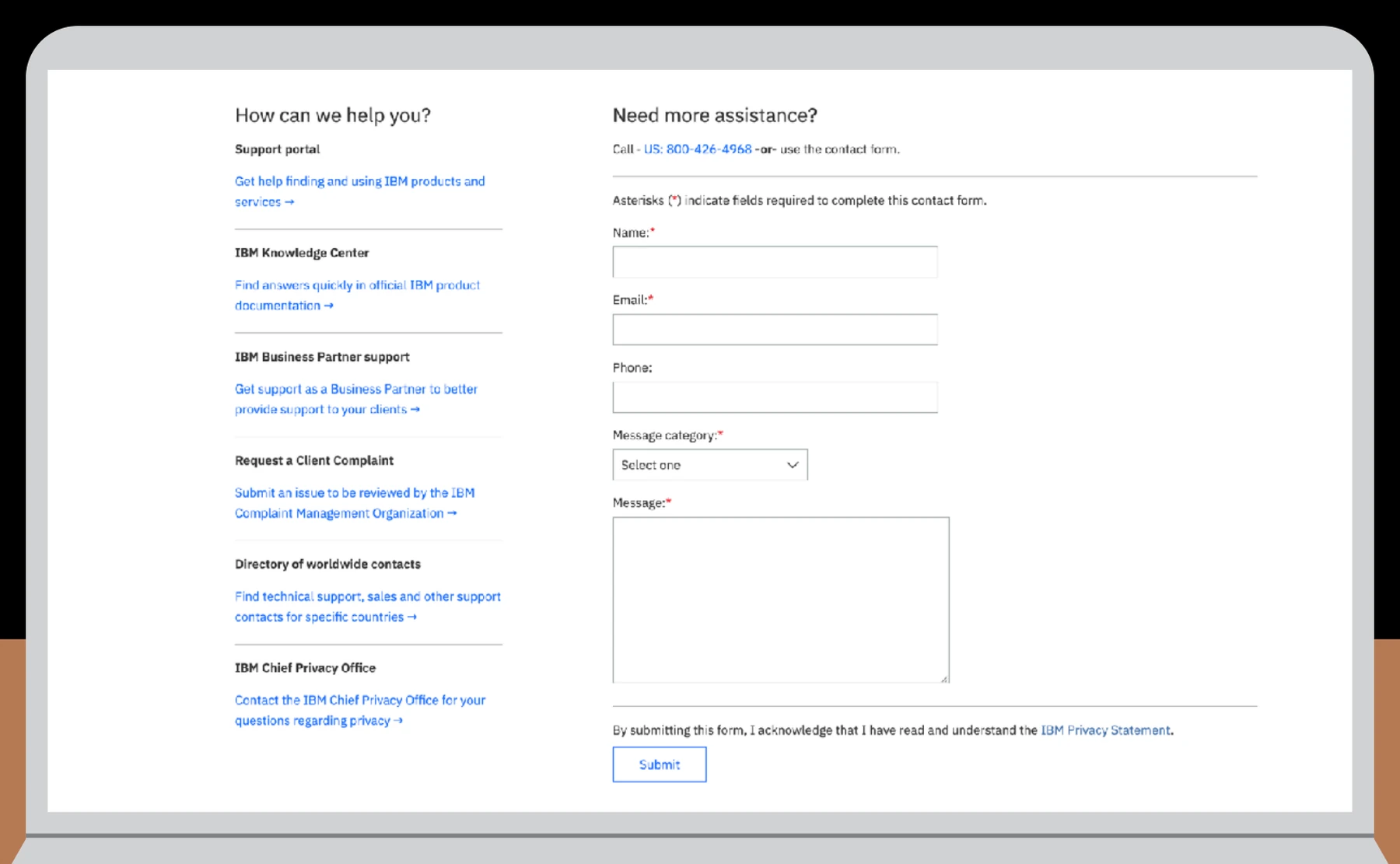
Historical IBM Contact Us experience showing a list of destinations beside an empty general contact form
Before | 2021 Contact Us experiencePlayback documentation preserved a long destination list beside a general contact form.

Research theme 01

Support overload

Many support destinations lacked a clear distinction, making it easier for inquiries to land with the wrong team.

Research theme 02

Inconsistent entry points

Product pages varied in what they offered, while someone seeking help expected a recognizable route from wherever they started.

Chapter 03 | A route before a form

Make the next destination visible.

We stopped treating Contact Us as one general form and began treating it as a routing experience.

The future state surfaced recognizable choices earlier, then connected each choice to something more useful: self-service information, technical support, sales, another direct route, or assisted contact.

The goal was not to keep someone inside an interface. It was to get them closer to the right inbox or person.

Mid-fi explorations | February 23, 2021

How the routing model took shape.

These preserved states show the team moving from a content-first directory toward grouped choices, direct contact routes, and a visible human fallback.

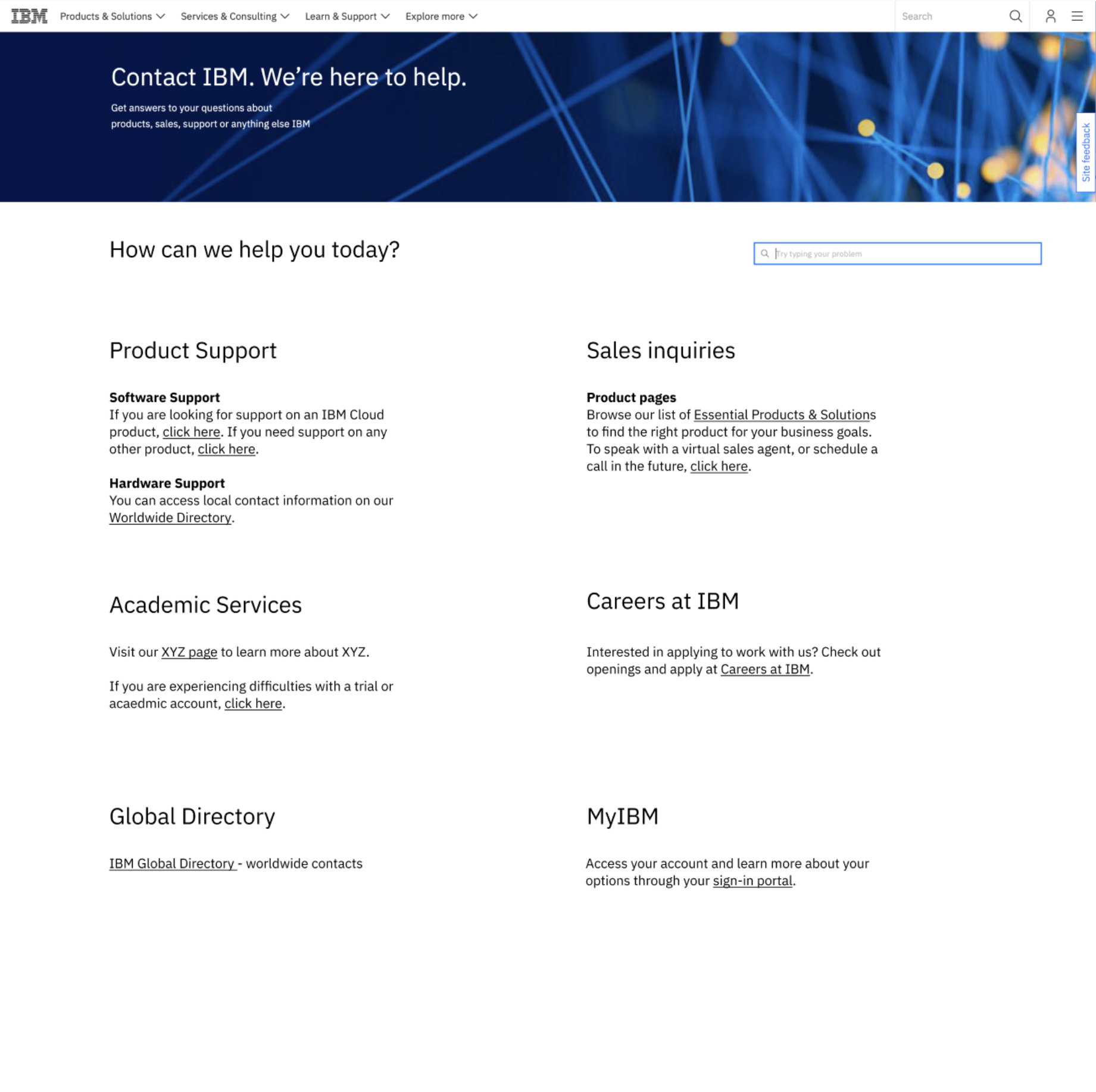
Mid-fidelity Contact IBM exploration organizing support, sales, academic services, careers, directories, and MyIBM as explicit routes
Mid-fi exploration | Route directoryA content-first model tested whether making destinations explicit could replace the generic starting point.
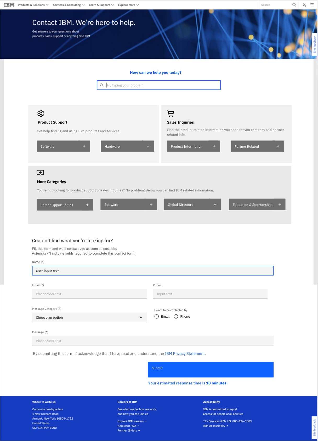
Mid-fidelity Contact IBM exploration combining topic cards with a general contact form
Mid-fi exploration | Topic cards and formGrouped topics moved the model toward guided choices while keeping a general fallback in view.
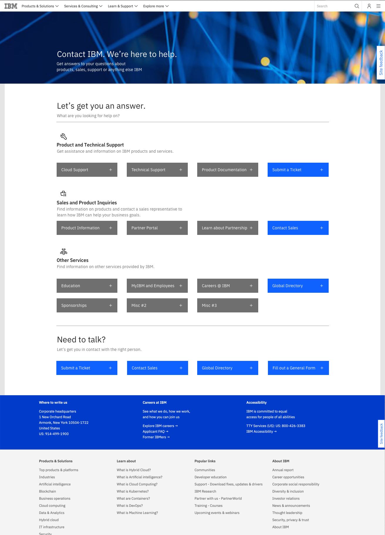
Mid-fidelity Contact IBM exploration showing a grid of support destinations and direct contact routes
Mid-fi exploration | Routing gridA denser branch grouped destinations and surfaced direct contact routes before the final visual direction.
Mid-fidelity Contact IBM exploration with an expanded in-page human contact form
Mid-fi exploration | Human fallbackAn expanded state explored an in-page form when routing still did not resolve the need.

Process provenanceThese team explorations were preserved in a February 23, 2021 playback. They document the concept's evolution. Individual screen ownership is not assigned.

Visual direction | Humanizing the front door

Making the front door feel more human.

I remember the intent as humanizing the front door: warmer language and people-centered imagery, followed by choices that helped someone recognize their situation without understanding IBM's internal structure.

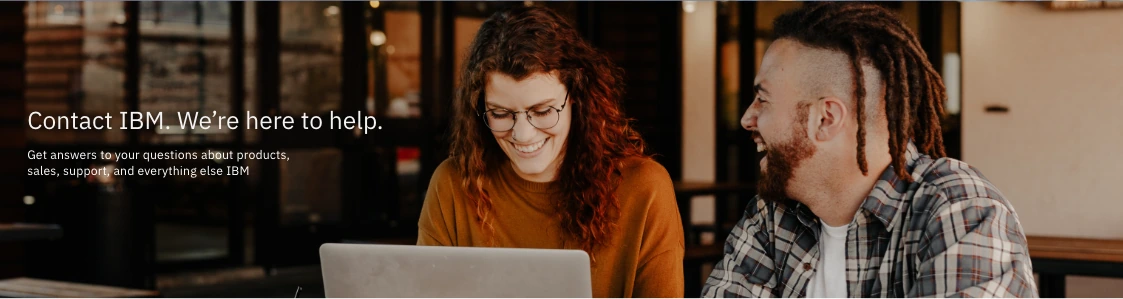
XD prototype hero showing two people working together at a laptop beside the words Contact IBM, We're here to help
XD prototype hero study | Collaborative helpA people-centered scene framed contact as something IBM could help someone work through.
Preserved future-state hero showing a smiling person beside the words Contact IBM, We're here for you
Preserved future-state hero | Welcoming front doorThe later hero made the welcome more direct: “Contact IBM. We're here for you.”
A warmer welcome.

“We're here to help” and “We're here for you” shifted the opening away from organizational language and toward the person arriving.

Recognizable situations.

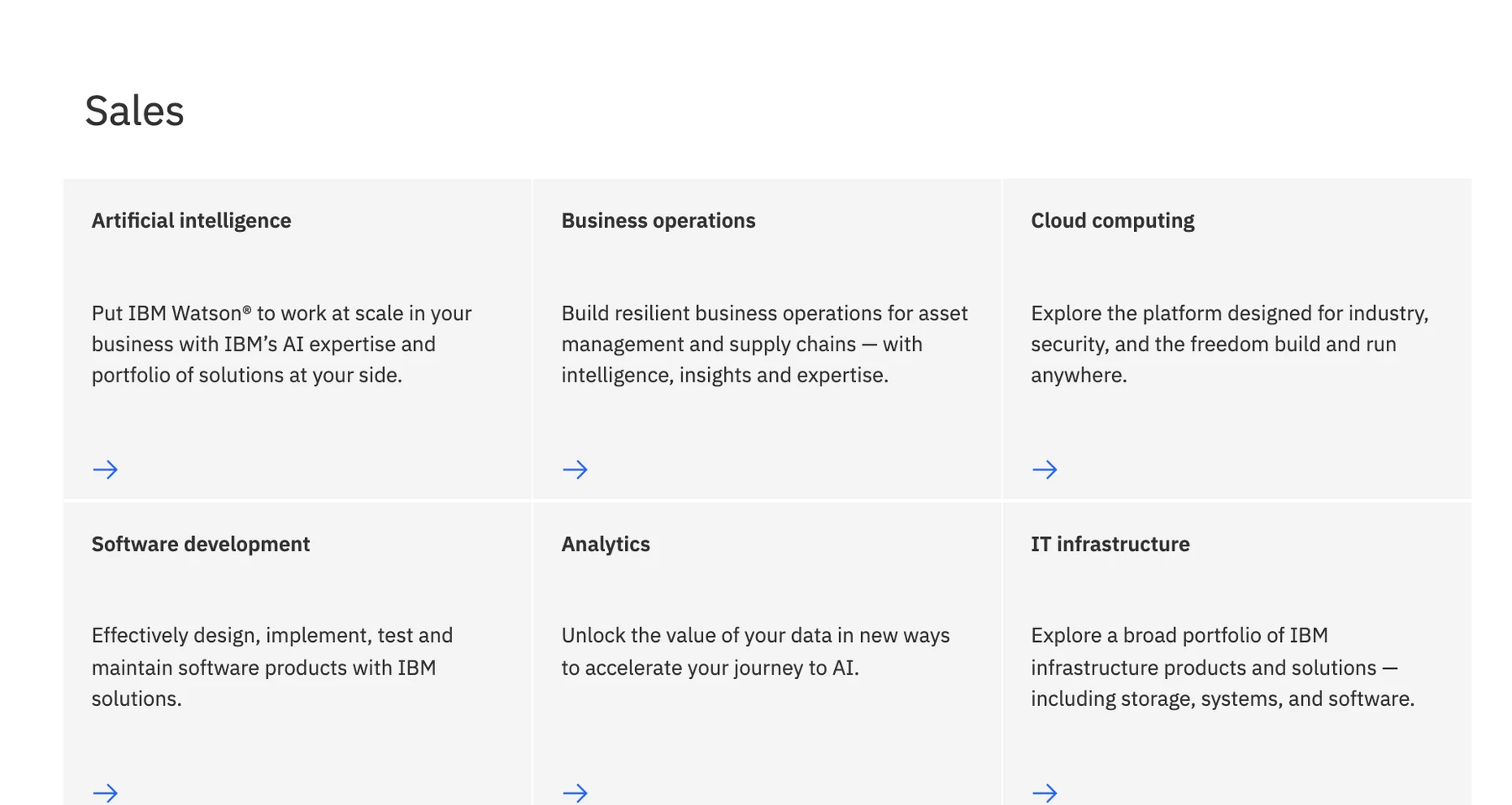
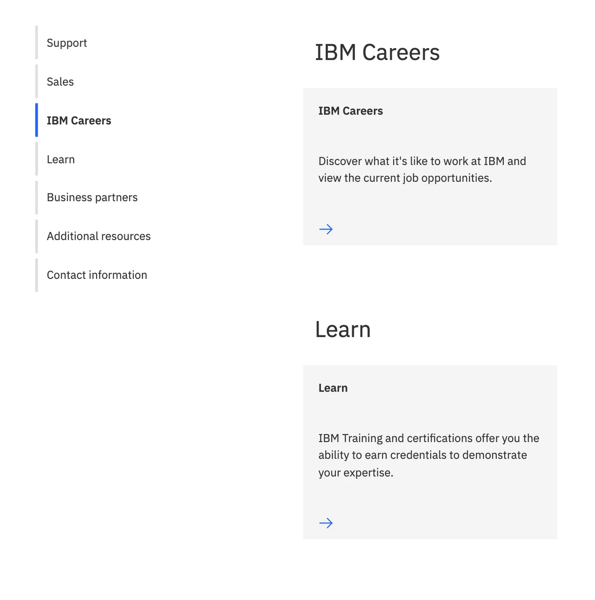
Support, sales, careers, learning, partners, and general inquiries became visible choices instead of one undifferentiated form.

A person still within reach.

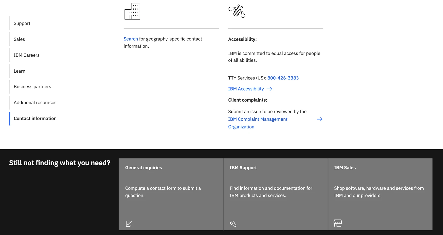
When self-service did not resolve the need, contact information and assisted routes remained visible.

Humanization rationaleThe visuals are historical artifacts. The language about wanting a warmer, more human experience is my present-day recollection, consistent with the preserved copy and imagery but not documented as a measured research finding.

Close-up of the 2021 future-state Sales routes arranged as six destination cards
Sales became a first-class routeSix recognizable destinations replaced one undifferentiated request path.
Close-up of the 2021 future-state navigation for IBM Careers and Learn
More than support and salesCareers and learning made the breadth of possible intent visible in the same system.
Close-up of contact information and the final general inquiry, IBM Support, and IBM Sales fallback routes
A useful fallback remainedThe concept still offered general inquiries, support, and sales when a clearer route did not resolve the need.

Chapter 04 | Final playback

Carry the work beyond the room.

The final presentation turned our research, routing, and interface decisions into a story that people outside the sprint could follow.

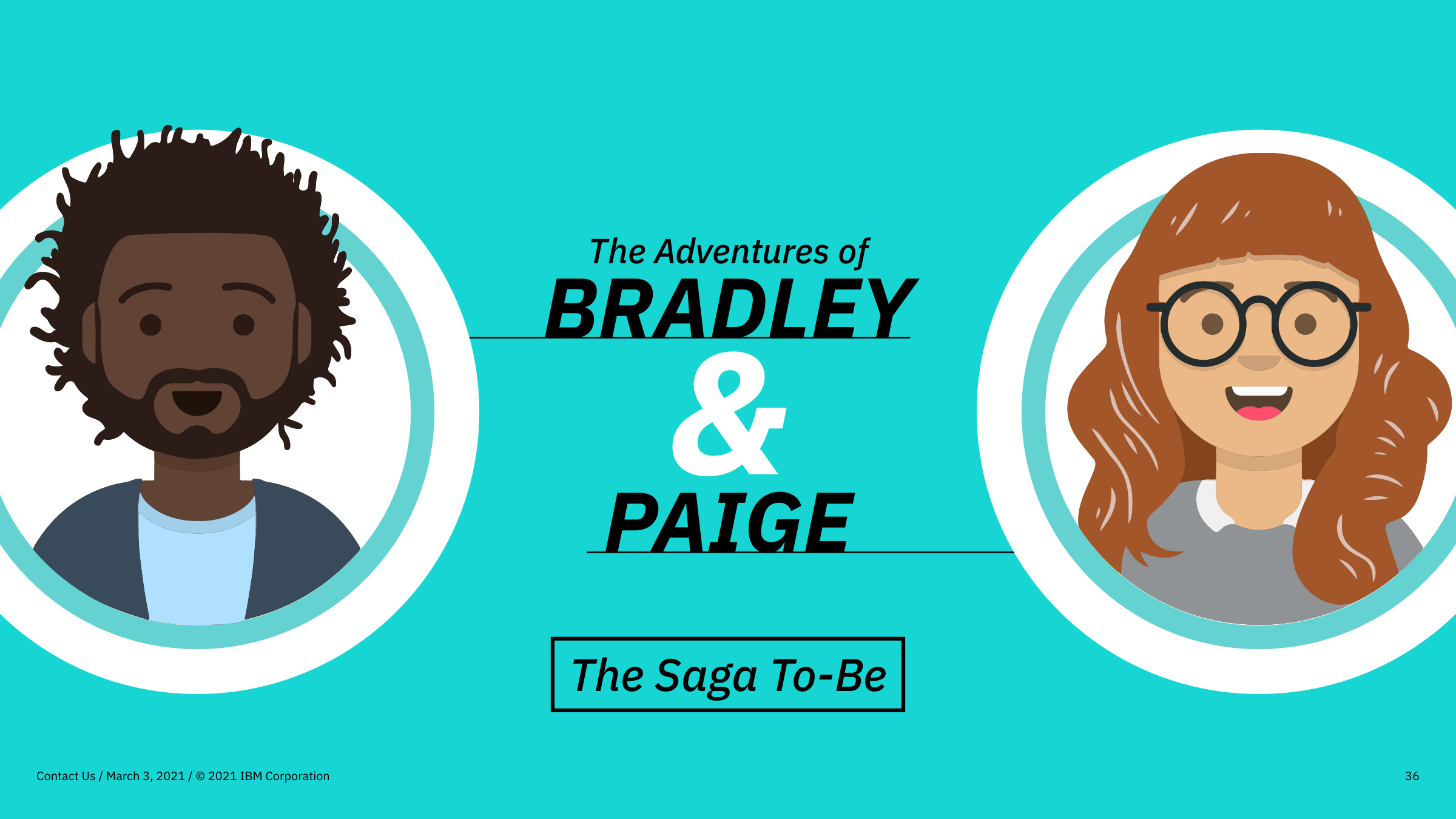
Final playback chapter card showing Bradley and Paige in The Saga To-Be
Playback evidence | The Saga To-BeBradley and Paige returned in the To-Be chapter, giving the future-state concept a human point of view.
I am still especially proud of the final playback. The story was very, very well received, and I remember people loving it and sharing glowing comments afterward.

Program feedback recognized my presentation storytelling, the way I helped co-lead the team, and how I connected user needs to research evidence.

Source noteThis paraphrases private program feedback. It does not expose reviewer identities or turn positive reception into measured product validation.

Chapter 05 | Influence and reflection

What carried forward.

We shared the future state with the team responsible for the real Contact Us experience. I remember the work being well received and later recognizing parts of its direction in the page.

The IBM Patterns prototype did not become the production page. What I remember carrying forward was a warmer entry, card-based choices, more useful routes up front, and clearer guidance based on someone's relationship with IBM.

If I revisited the problem now, I would keep that human goal: interpret intent, make the next destination clear, confirm where a request went, and keep a real person within reach.

Influence and concept boundaryThis is a bounded first-person recollection. Similarity in later versions does not prove exact lineage, sole authorship, or direct implementation. This is not a designed, tested, or implemented AI system.